
Case Study -Meteora
user research for
e-commerce web
Client: Meteora
Case Study Duration: 8 weeks
Freelance - Designed 27 pages
My Role: Discover, Define, Design, and Deliver (UX Double Diamond)
Tools Used:
- Trello
- Miro
- Sketch
- Craft
- InVision

Meteora is a start up of selling fine jewelry in Sao Paulo, Brazil. It was founded by Regina Vassilopoulos who always had a great passion for fashion. In addition to being an entrepreneur, Regina also works in tax management. At the moment she works in the department's coordination. She has great experience in importing everything that comes to Brazil.
As Meteora is a start-up and is growing rapidly in sales but the company has no sales catalog. The products are posted on Instagram and it is difficult to create a product sales page on Facebook.
My goal is to create an e-commerce site that makes it easier for Meteora customers to search for jewelry that they want and make their purchases from anywhere efficiently and easily.
Understanding the Challenge


Competitors do not have
e-commerce web
Researching in depth about the activity of semi-jewels in Brazil, specifically in Sao Paulo, and making a general analysis of the competitors of the region in which Meteora operates, I discovered a lot of interesting things:
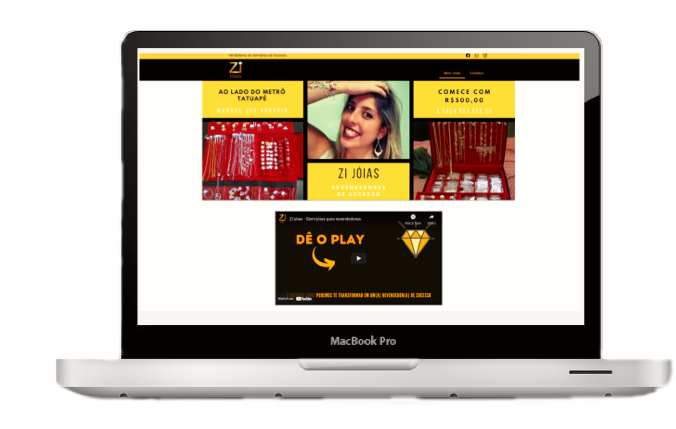
The only one that has a website and Zi Joias but she doesn’t sell anything on the website.
When I started doing my research Emporio do aco had a website as well but it didn't sell on the page. However, nowadays, they deactivated the page, but the company remains active.
None of the 3 competitors Zi Joias, Emporio do Aco, and Pavao Bijoux have an after sales support channel or a way to communicate with the company to resolve doubts.
Vendors / comparatives have several flaws in navigation

Rinkawesky
They are great in Social media
They have many global navigation
They not sell online
Gazin
They are very good in payment methods options
They have bad typography and different icons that cause confuse in the navigation

Rommanel
They are good in navigation and communication
They have some problems in the filter and back button is not working

Pain Point
Users need fast and quality navigation with efficient after-sales support so that they can make their purchases smooth and satisfied.
Meet Marcia Campos
Marcia is that Brazilian woman who is always busy either at work or at home. Like every Brazilian woman she likes to dress up and use various accessories. As Marcia is very busy she is giving preference to buying through the sites she trusts, however, she has been frustrated because most of them do not have legal support after sales and do not have a direct line with a person who can really help.
Name: Marcia Campos
Age: 39 years old
Pronouns: She/Her/Hers
Place: Sao Paulo, BR
Profession: Digital Marketing Analyst
Quote:
“ I miss support after sales. I already needed to exchange parts and I couldn't"
Goals:
Marcia wants to find videos and testimonials from customers.
Marcia wants to find personalized kit options, where, when making a personalized purchase, she gives her the right to have the product delivered to another location.

Behavior:
Marcia see the products pics and understand if they are of quality and refer to the real product.
Marcia only buys on trusted sites.
Habits:
If the product does not already have the built-in delivery fee it will no longer buy through the website.
Marcia only buys if she realizes that the site is organized and easy to make the purchase.
Marcia makes large purchases and installs several times.
Pain and Frustration:
Having to change products makes Marcia waste a lot of time.
The lack of after sales support leaves Marcia very unhappy.
Marcia is annoyed when she does not know how long the product will arrive at her door and she is not even notified when there are delays.
Focus on Product (custom kits), payment options and pos sale support

The names given in the collections by users in Brazil are quite different from those given by American users.

Romantic Classic Beach Relaxed Modern Day-to-day Sophisticated Chic Good Energy
American sites do not usually use name for collections. When used, they are specific names to distinguish the occasion and they are with more simplicity.


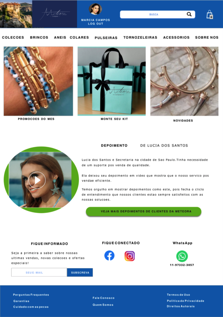
Putting everything together in my greyscale design


Collections, earrings, rings, necklaces, bracelets, accessories, support, about us
Positive results on the usability testing
My goal was to test the functionality of the pages and check if they have a quick and easy navigation for the user.
Tasks were:
Getting the user to browse pages
Make the user able to add an item to the cart
Get the user to complete their purchase
Make the user find suitable support.
___________________________________________________________________
Users successfully achieved all tasks and in a few clicks.
100% of users found the checkout to be practical and very user friendly.
75% of users accessed support directly from the phone number.

Typography and Colors


Having fun on my High Fidelity


So far there are 27 pages, but it should come much more.

Usability Testing
Design copyright page
Design “ Take care of your jewels” page
Design Warranty terms page
Links to social Media
Add more product pages
Fix small framing errors
Usability testing for those modifications